Vans - Dismantle Racism
Vans is a family business. It started that way, and over the years the family has grown. In their family there is no place for hatred or bigotry. When one of them feels the pain of racism and injustice, it diminishes them all, but it does not hurt them all equally. They understand they have to work harder to make sure everyone is respected and heard. This means looking inside and outside, changing what they must, and helping others do the same. If one of them hurts, then they all do. This mantra drove the need for change and bring awareness to change.
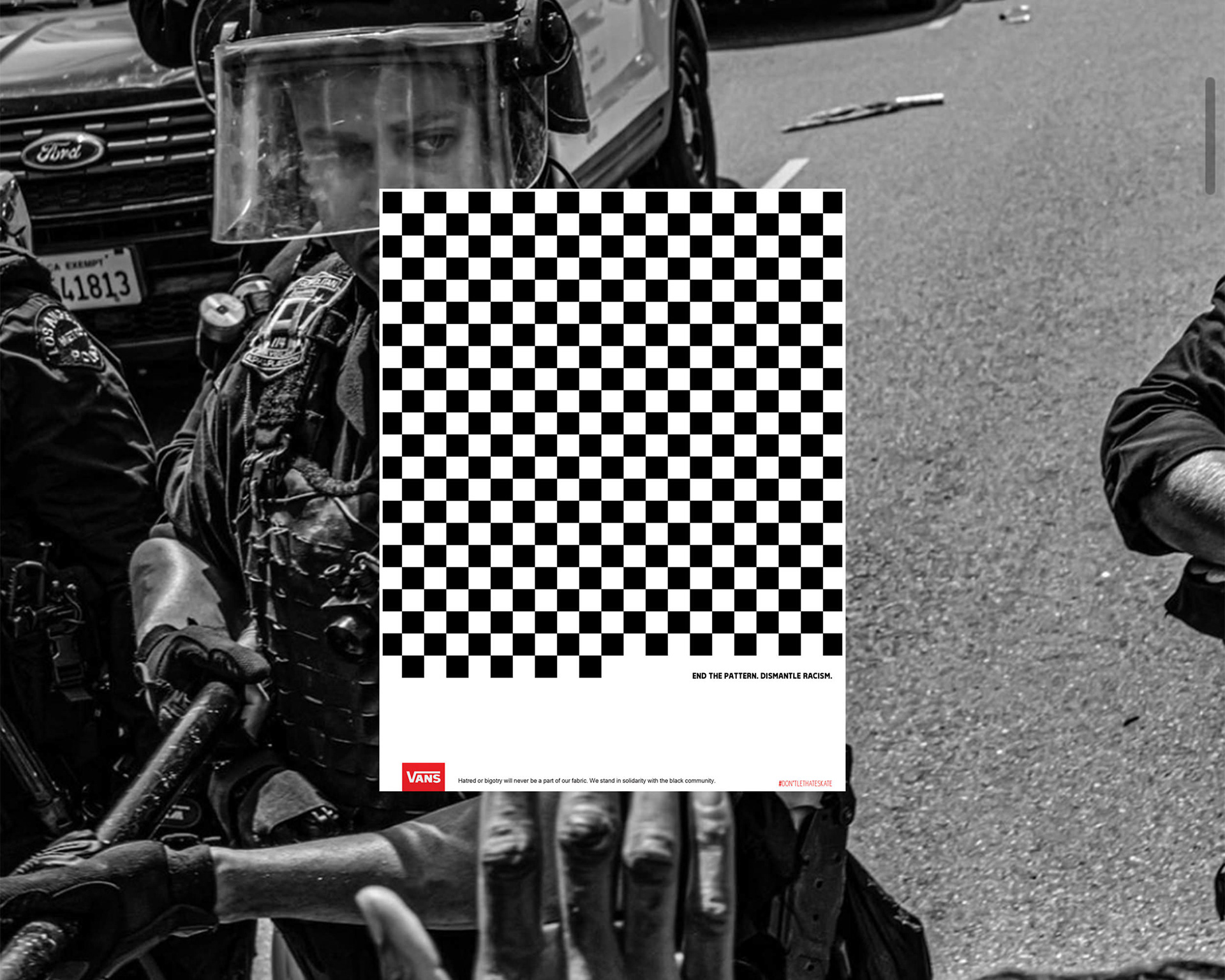
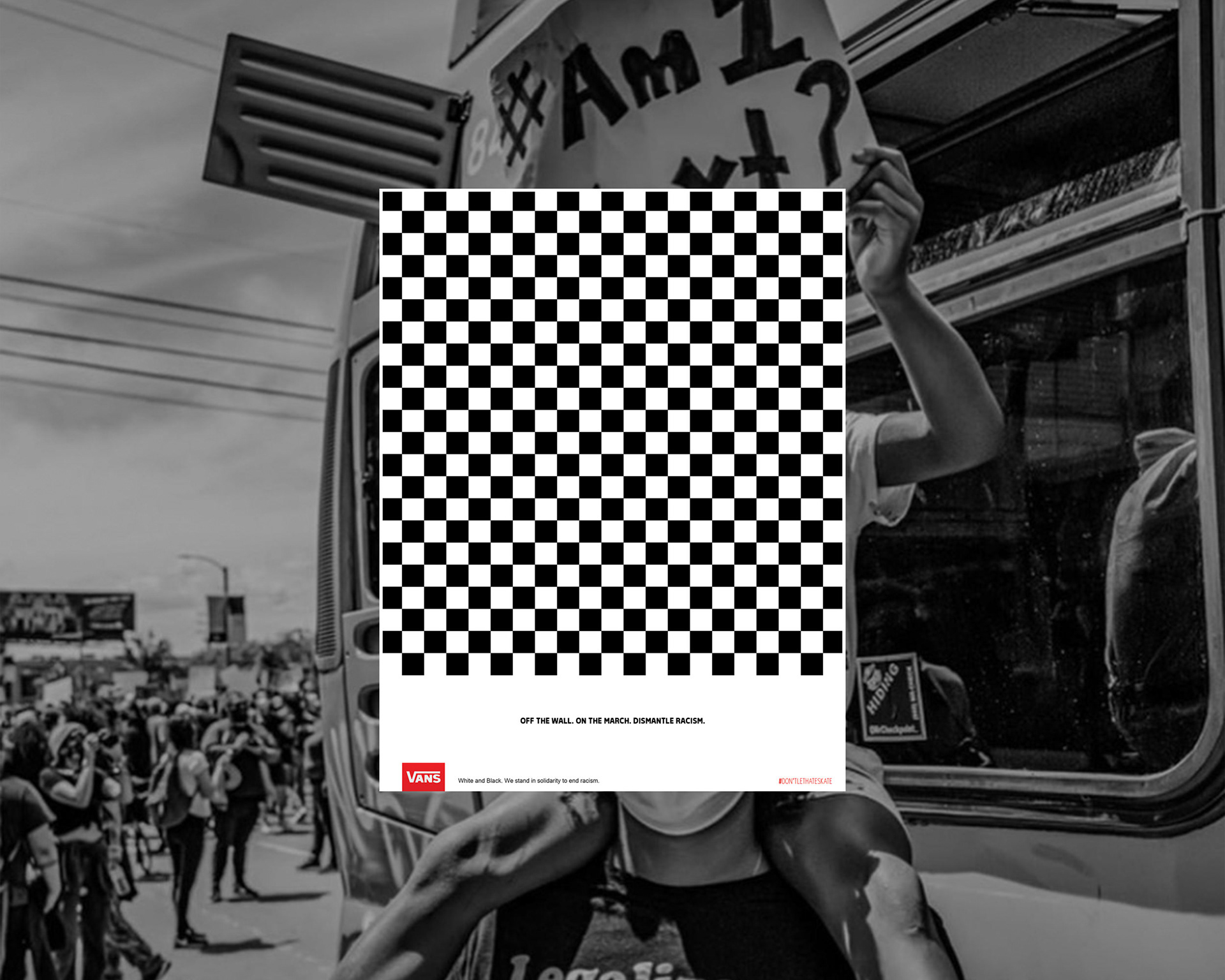
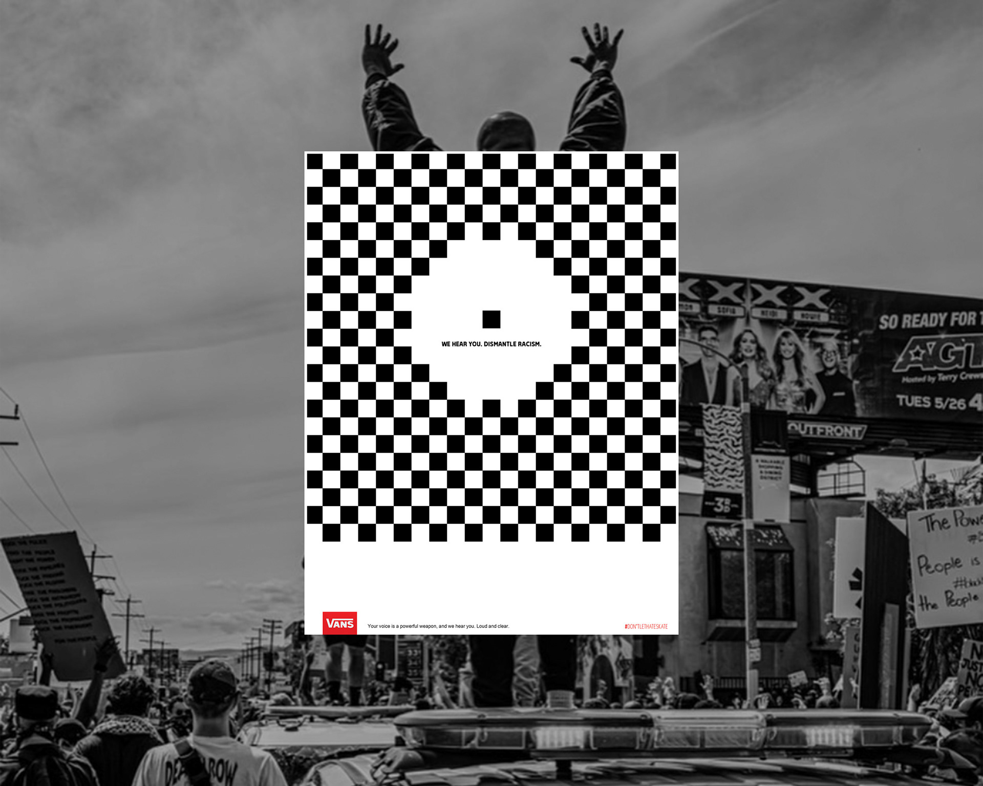
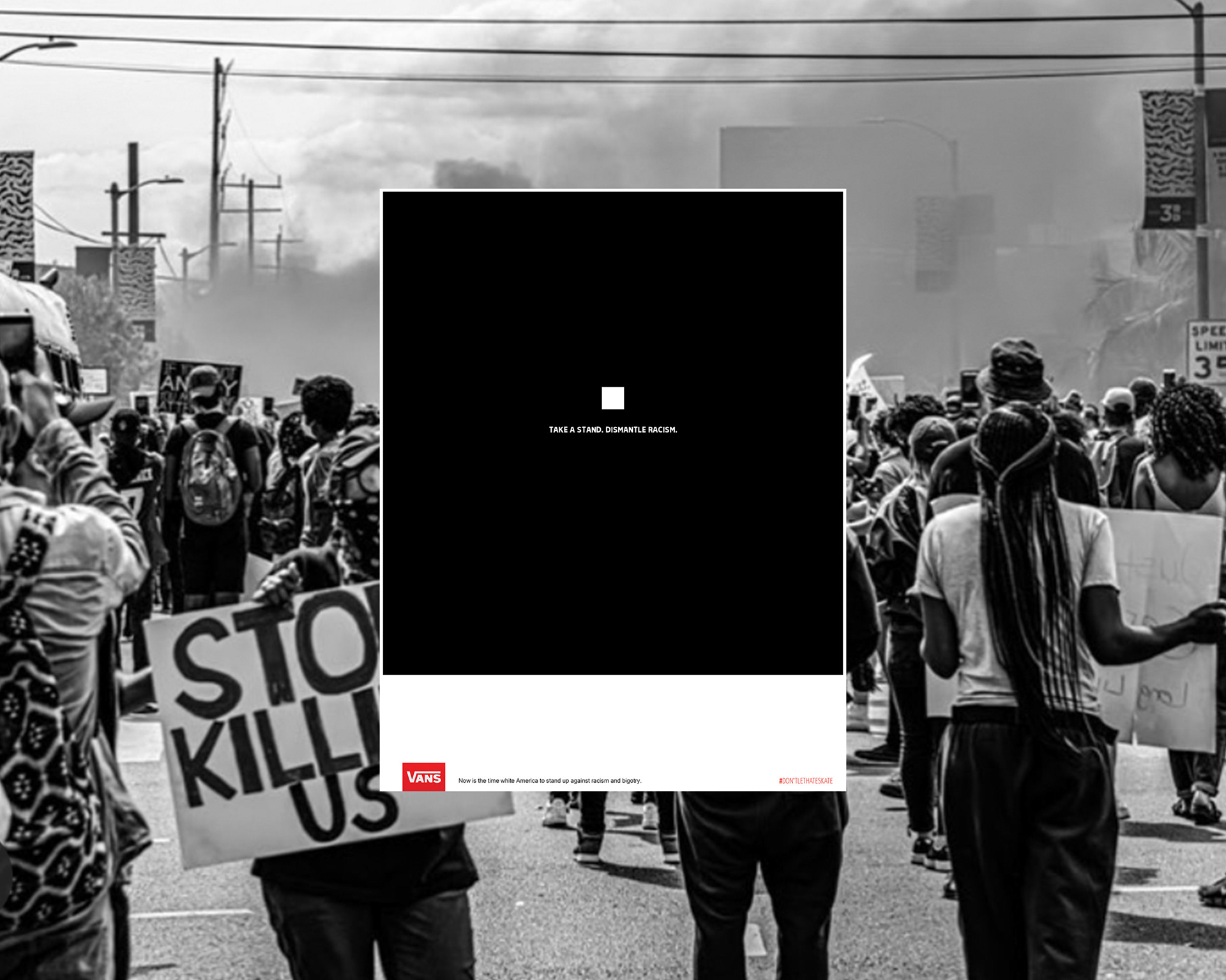
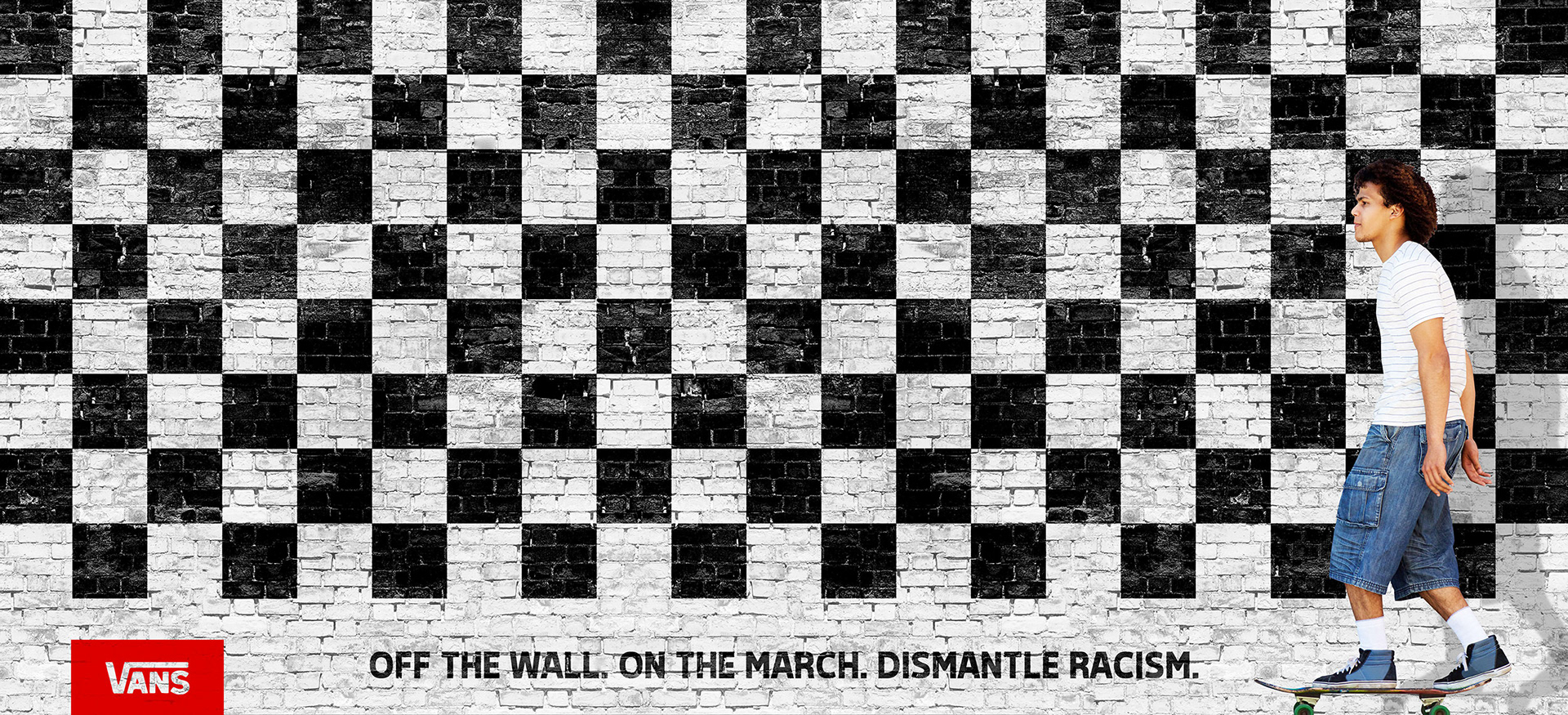
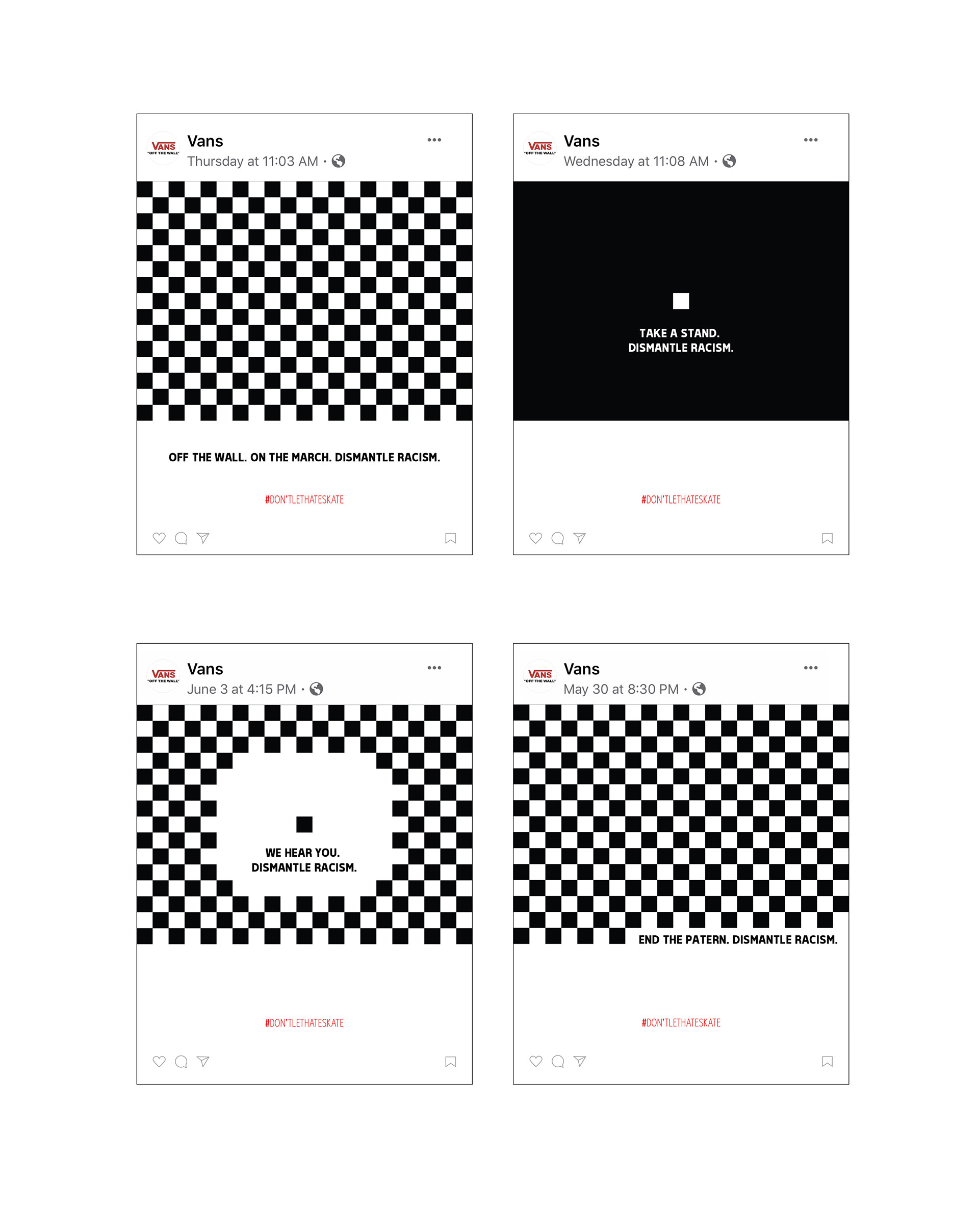
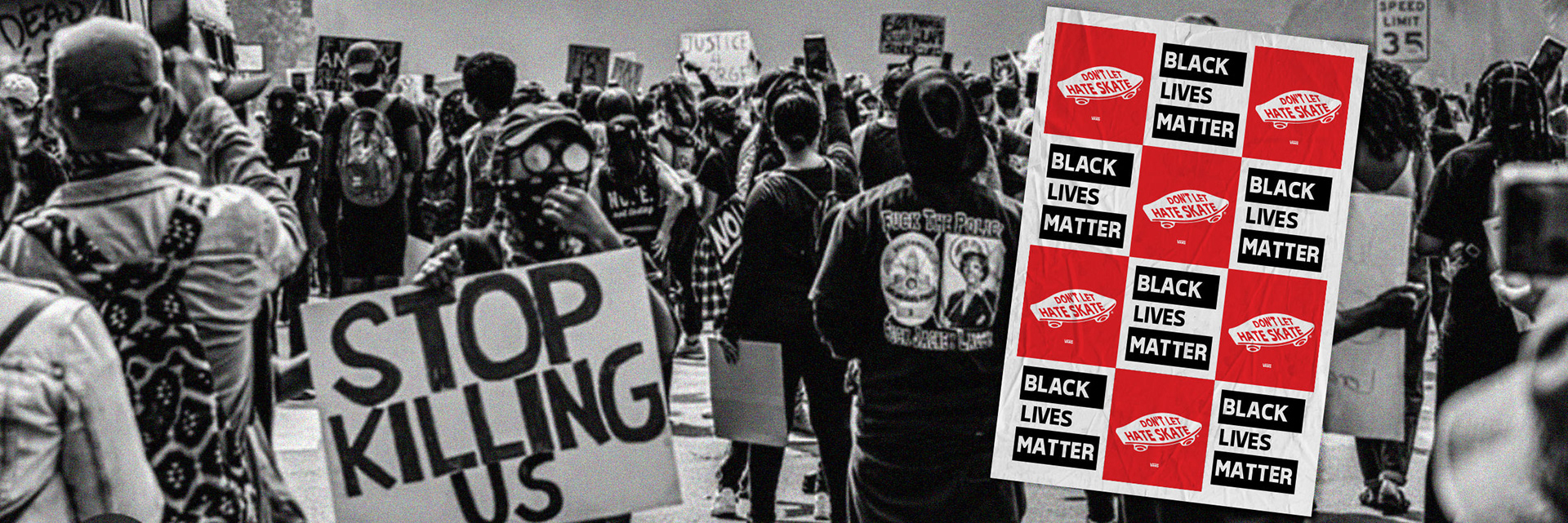
Paul Van Doren knew this, and when Vans became "the" shoe for alternative thinking change is what was needed. Change was embraced. This same need for change is what helped drive these executions. Using the iconic traditional black and white checkered pattern to drive the overarching message - change. Or, end the pattern. This idea of change was used across various interpretations of the pattern to convey the need for those with voices to be heard through change.
Skills:
• Environmental Design
• Visual Design
• Social Awareness
• Illustration
• Creative Direction
Solution:
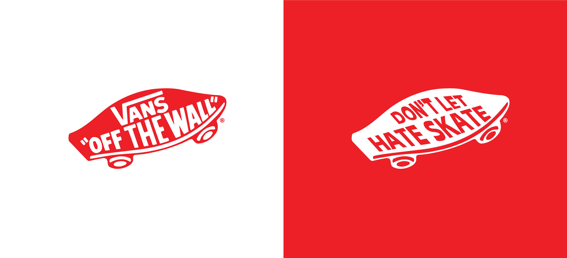
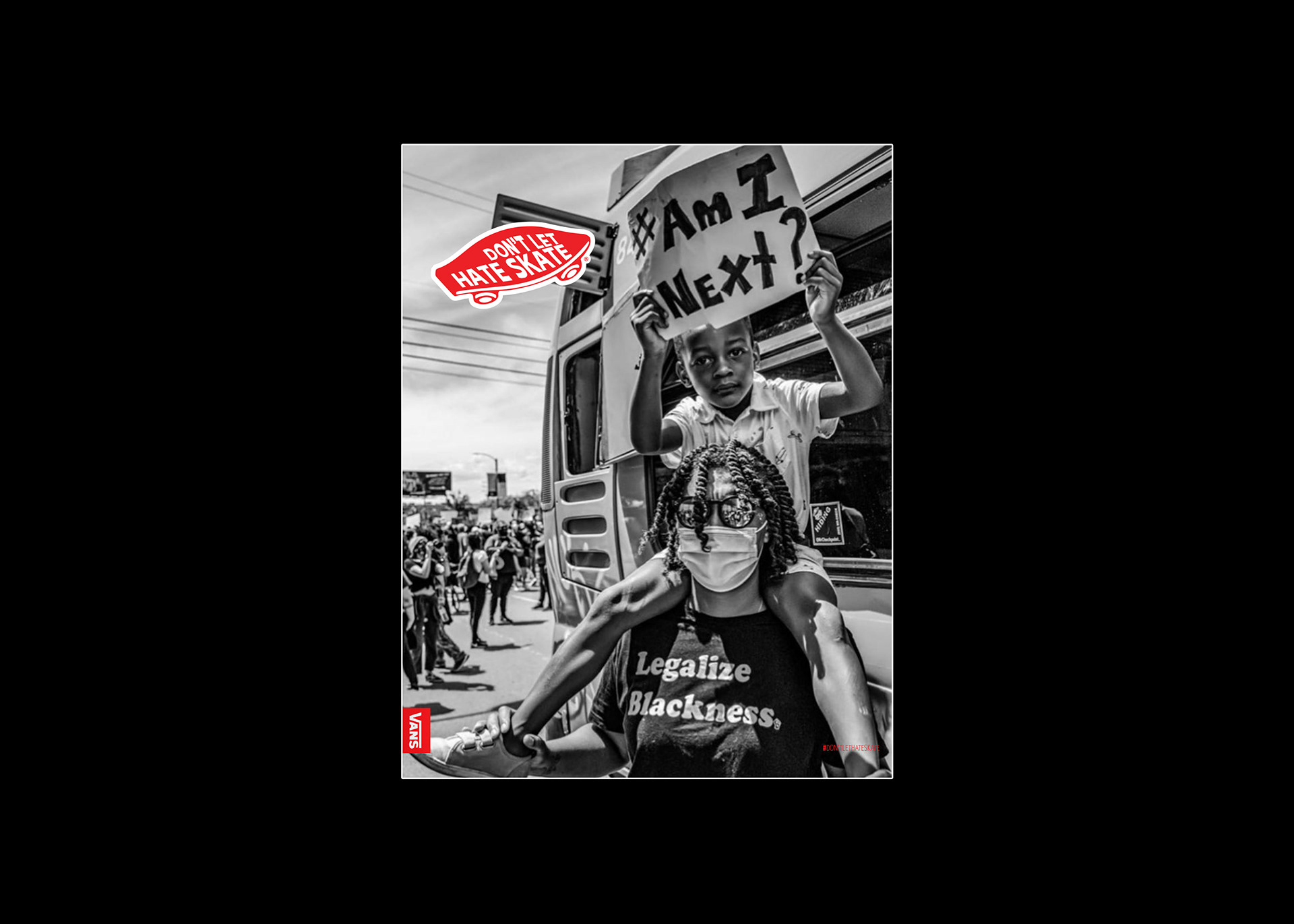
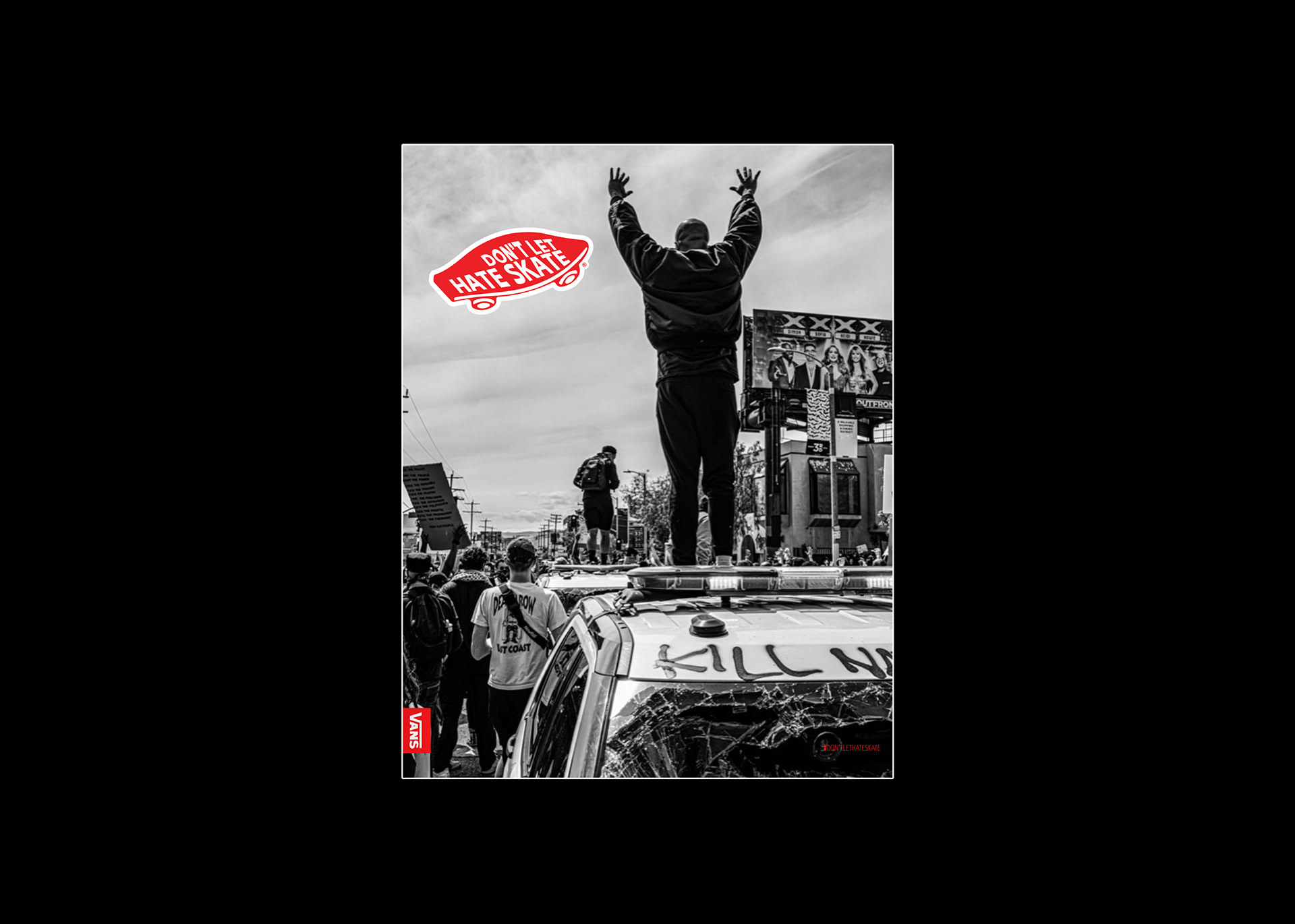
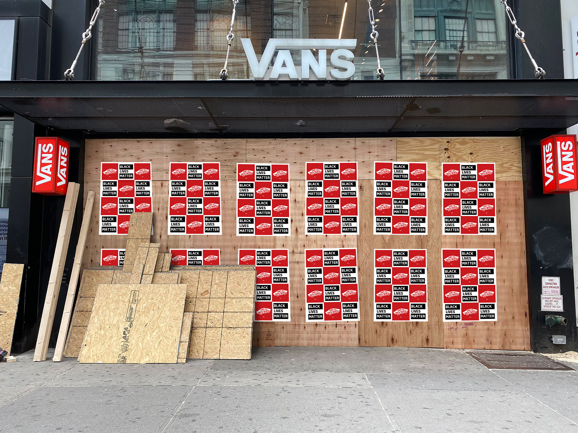
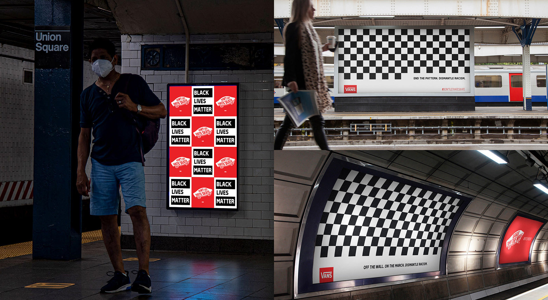
Using imagery taken during the 2020 demonstrations, crafted image ads and developed a branded element using the iconic Vans skateboard logo and checkered pattern to communicate the message of not letting hate skate. This simple yet effective graphic element was used as the headline treatment to allow for the images to speak loudly to the audience. The hashtag #dontlethateskate was the only copy element used throughout all executions.
Out-of-home deliverables were to be used throughout urban sprawl to reach mass transit users as they commute throughout city scapes. Simple paste up to be adhered to different applications to reinforce the movement.